Understanding Icons in Digital Design
What Are Icons?
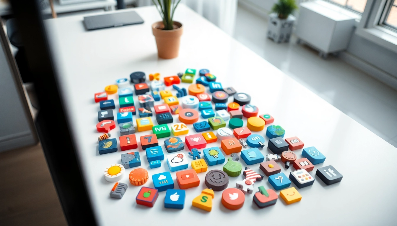
Icons are simplified graphical representations used to convey ideas, actions, or objects visually. In digital design, they serve as essential visual cues that help users navigate and interact with interfaces. Unlike detailed illustrations, icons are often minimalist, designed to be instantly recognizable at different sizes. Common examples of icons include a trash can for deleting a file, a magnifying glass for search functions, and a gear for settings.
Importance of Icons in User Experience
Utilizing icons enhances user experience (UX) significantly. They provide a visual interface that communicates meaning quickly and effectively, which is vital in our fast-paced digital world. By using icons, designers can reduce cognitive load, making navigation intuitive and enjoyable. This not only promotes faster decision-making but also creates a more engaging and accessible environment for users.
Types of Icons: From Simple to Complex
Icons can be categorized based on their design complexity and purpose:
- Simple Icons: Basic shapes and symbols (e.g., arrows, geometric shapes) that serve functional purposes, often representing common actions or objects.
- Complex Icons: More detailed images that may offer intricate illustrations of objects (e.g., camera, laptop) or communicate abstract concepts.
- Brand Icons: Logos and unique symbols that represent specific brands, often characterized by their distinct visual identity.
- Functional Icons: Used to indicate functions such as ‘save’, ‘share’, ‘download’, etc., playing critical roles in user interactions.
Where to Find Quality Icons
Top Websites for Free and Paid Icons
Accessing quality icons is easier than ever, thanks to numerous online resources. Here’s a curated list of some top-notch platforms:
- Flaticon: With over 18 million vectors, Flaticon is one of the largest databases for free icons in various formats including PNG, SVG, and EPS.
- Icons8: A robust resource for free icons across a multitude of themes including graphic design, UI, and social media, available in formats like PNG and SVG.
- Noun Project: Offers a vast collection of icons and customizable options, making it easy for designers to find the perfect match for their projects.
- Material Icons by Google: A library enriched with over 2500 glyphs in a single font file. It’s particularly useful for mobile and web application designs.
- Font Awesome: Known for its expansive array of 1.8 million icons usable in projects without extensive graphic design knowledge.
Curated Icon Packs for Specific Needs
When searching for icons, considering curated packs can save time and ensure consistency. Many websites offer curated collections tailored for specific themes or industries. For example, a health care application might benefit from an icon pack dedicated to medical symbols, while an e-commerce site could seek packs featuring shopping-related icons. Utilizing these curated collections can streamline the design process and help maintain a cohesive visual language throughout your project.
Custom Icon Design: When to Consider
While existing icon resources are plentiful, there are instances where custom icon design becomes necessary. This is particularly relevant for brands looking to establish a unique identity or when a project demands specific visual storytelling. Custom icons allow for greater creative expression and alignment with brand values. When commissioning custom designs:
- Define Your Needs: Understand what icons are essential for your project and how they will fit into your overall design.
- Sketch Ideas: Collaborate with designers by sharing basic sketches or concepts that encapsulate your vision.
- Iterate on Feedback: Work closely with your designer to refine the icons until they meet your expectations.
Using Icons Effectively in Your Projects
Best Practices for Icon Use in UI Design
Effective integration of icons in user interfaces involves adopting best practices that enhance usability and aesthetics:
- Clarity: Ensure icons are easy to understand. The meaning should be immediately apparent without requiring additional explanations.
- Consistency: Use a consistent style across your iconography (i.e., same shape, color, and theme) to create a unified look.
- Accessibility: Ensure icons are designed with accessibility in mind, such as providing text labels or alternative descriptions for screen readers.
- Contextual Relevance: Place icons in context where their meaning will be clear to users (e.g., a shopping cart icon should be associated with a checkout process).
Combining Icons with Text for Clarity
Icons are powerful when combined with text. Using a word or phrase in conjunction with an icon can improve comprehension. For example, an ‘upload’ icon accompanied by the text ‘Upload File’ clarifies the action. Additionally, positioning these elements consistently within layouts helps users quickly process information, fostering a smoother navigation experience.
Responsive Icon Design Considerations
With the growing variety of devices and screen sizes, designing responsive icons is crucial. Here are key considerations:
- Flexible Sizing: Icons should scale seamlessly on different resolutions without losing clarity or detail.
- Touch Targets: Ensure icons are touch-friendly, particularly on mobile devices, by maintaining appropriate size and spacing.
- Testing Across Platforms: Verify how icons render on various platforms and make adjustments as necessary to maintain their integrity.
Enhancing Brand Identity with Icons
Creating a Unique Icon Set for Your Brand
To establish a strong brand identity, developing a unique set of icons that reflects your brand’s personality is crucial. A well-crafted icon set can convey values and evoke emotions:
- Research Relevant Icons: Identify symbols that resonate with your target audience and align with your brand messaging.
- Design with Purpose: Each icon should serve a functional purpose while also embodying the brand’s aesthetic style.
- Test for Recognition: Gather user feedback to ensure your icons are easily recognizable and effectively communicate the intended message.
Icons as Part of a Broader Visual Language
Icons are not standalone elements; they integrate into a broader visual language that encompasses colors, typography, and layouts. A cohesive visual identity improves the overall branding strategy. Consider how your icons work harmoniously with text and images to create a unified presence across all touchpoints.
Case Studies: Brands That Use Icons Effectively
Numerous brands consistently use icons to bolster their identity and enhance user experience. Here are a few examples:
- Dropbox: Utilizes simple, recognizable icons that effectively communicate their functionalities, making it easy for users to understand complex tasks with minimal text.
- Slack: Known for its playful icons, Slack blends functionality with engagement, contributing to a light-hearted and user-friendly interface.
- Airbnb: Their icons not only serve functional purposes but also reflect the brand’s focus on unique travel experiences, reinforcing the core brand identity.
Future Trends in Icon Design
Emerging Icon Styles and Technologies
The landscape of icon design is ever-changing, with new styles and technologies emerging continuously. Keep an eye on the following trends:
- 3D Icons: As demand for more engaging and interactive designs grows, 3D icons that offer depth and realism are becoming more prevalent in digital applications.
- Animated Icons: These icons add an interesting dynamic to interfaces. Subtle animations can draw attention and guide users through experiences more effectively.
- Voice-Activated Icons: With the rise of voice technology, icons may adapt to represent voice commands or responses, creating a new layer of interaction.
The Impact of Mobile on Icon Design Trends
As mobile devices continue to dominate, icon design is heavily influenced by mobile usability. Icons must be optimized for smaller screens, leading to minimalistic designs that focus on essential functionality. Additionally, touch-based interactions necessitate larger, more tactile icon designs for intuitive user experiences on smartphones and tablets.
Icons in the Age of Minimalism
Minimalism continues to reign in design, influencing how icons are created and perceived. Simple, flat designs that avoid clutter and distractions are favored, promoting clarity and purpose. Icons need to communicate effectively with fewer elements, making each visual choice impactful. Designers will increasingly focus on honing in on the essence of iconography, refining shapes and color palettes to align with this movement.